Superbloom
2021


A rebrand for a nonprofit championing the global transformative movement in tech, using co-design process
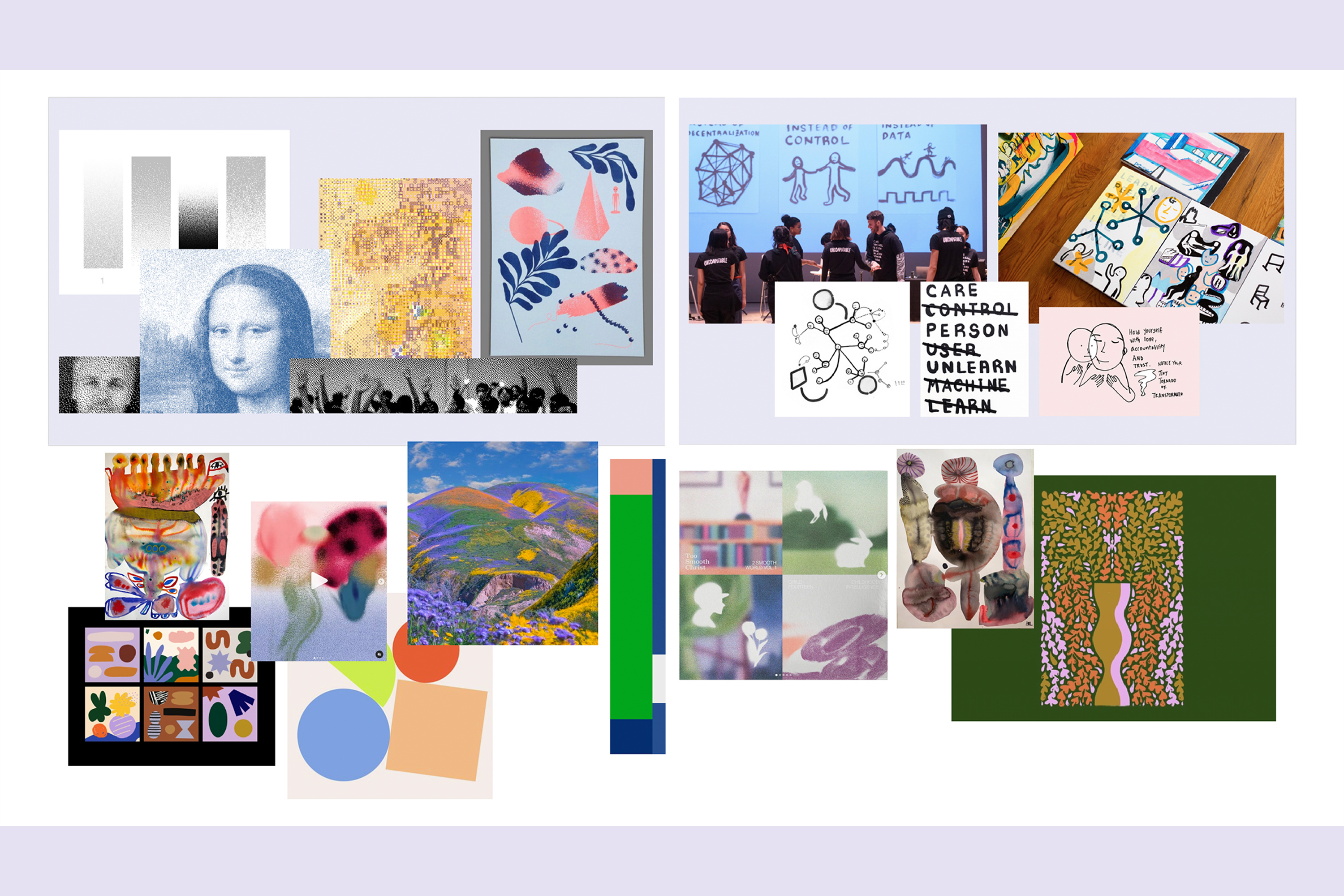
As the lead designer for Superbloom’s rebrand (formerly Simply Secure), I partnered with the team to craft a visual identity that reflects their mission to create responsible, inclusive technology through human-centered design. I facilitated community workshops to surface shared values and aesthetics— these exercises influenced not only the look and feel of the brand but also informed decisions around the organization’s name, tagline, and core identity.
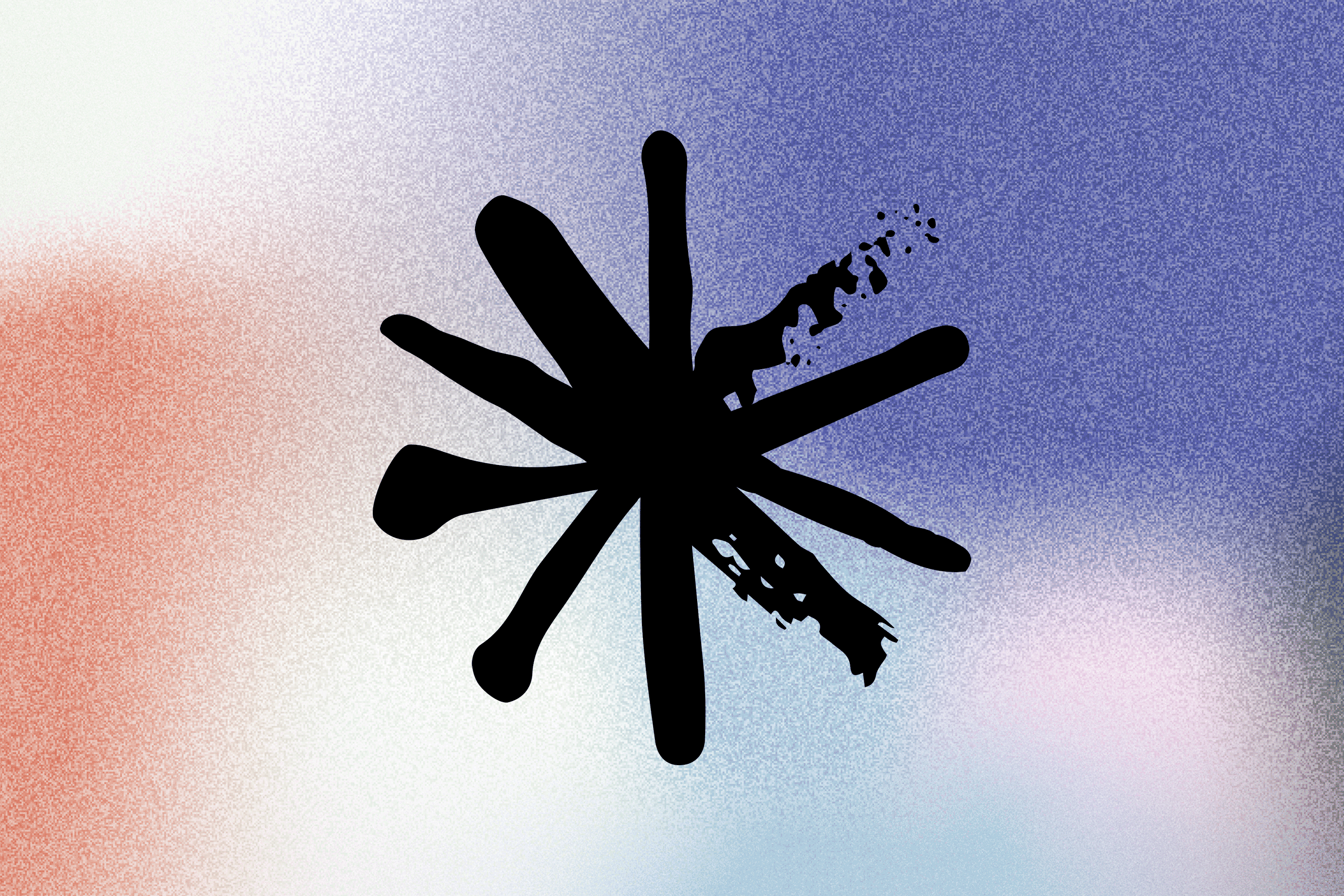
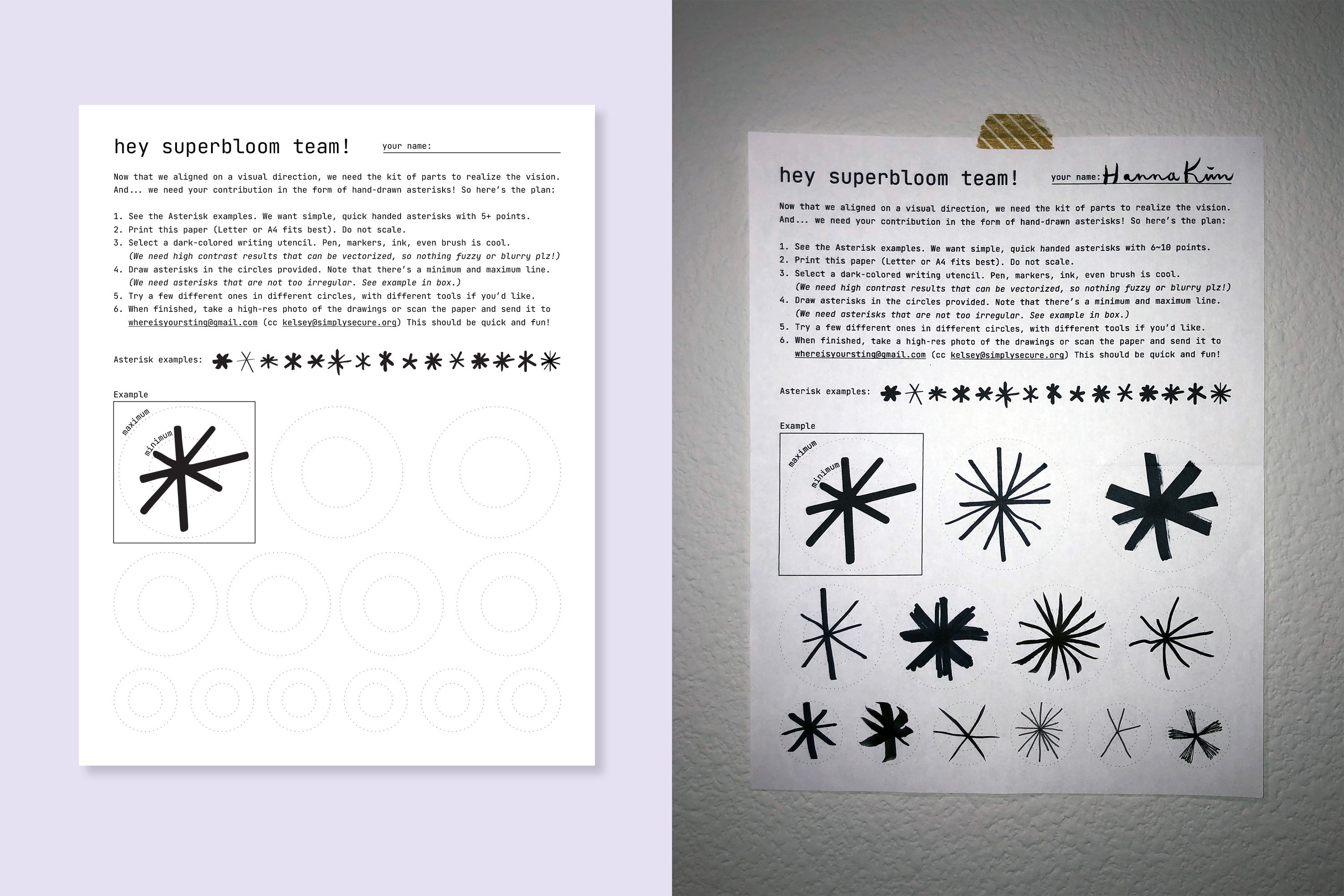
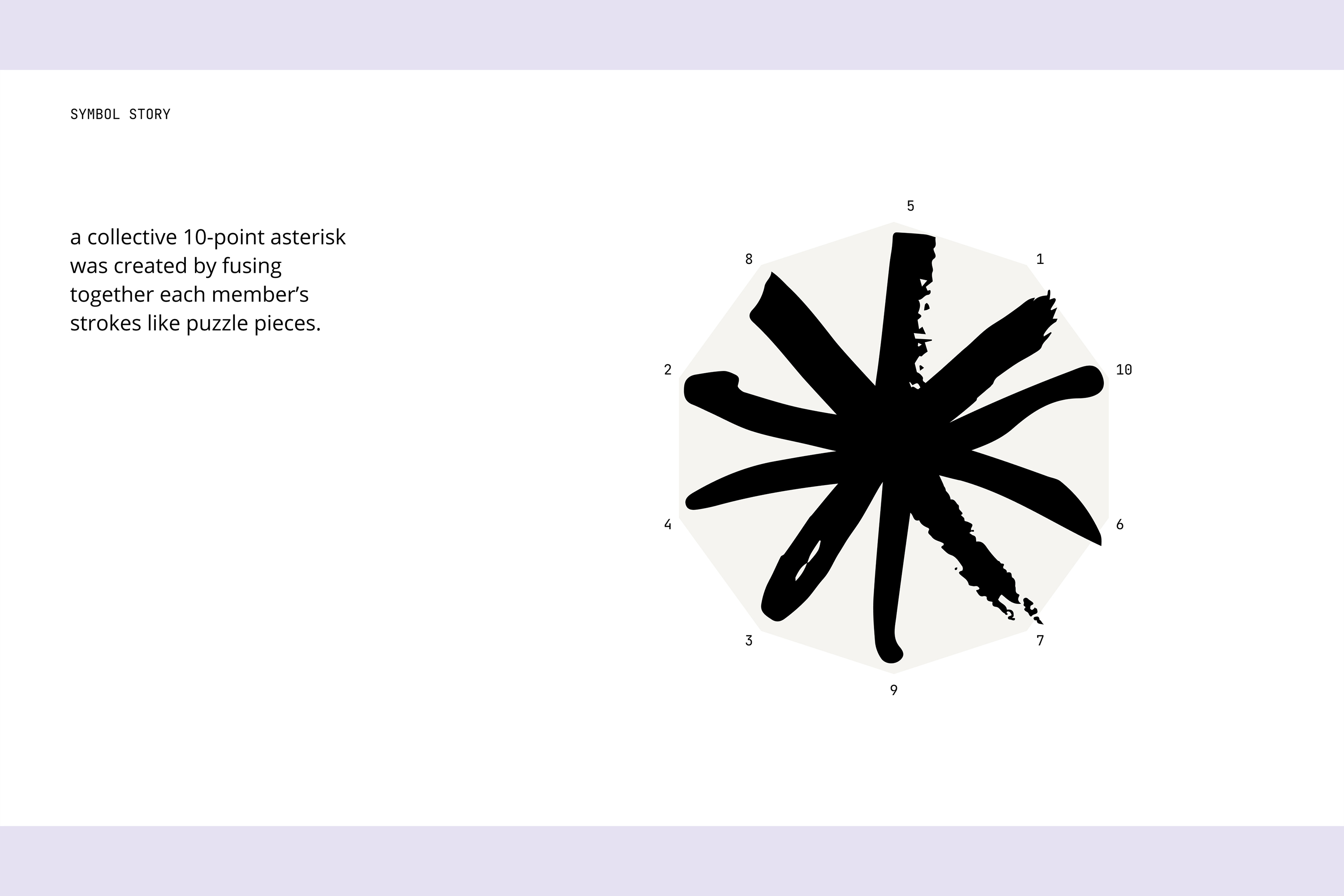
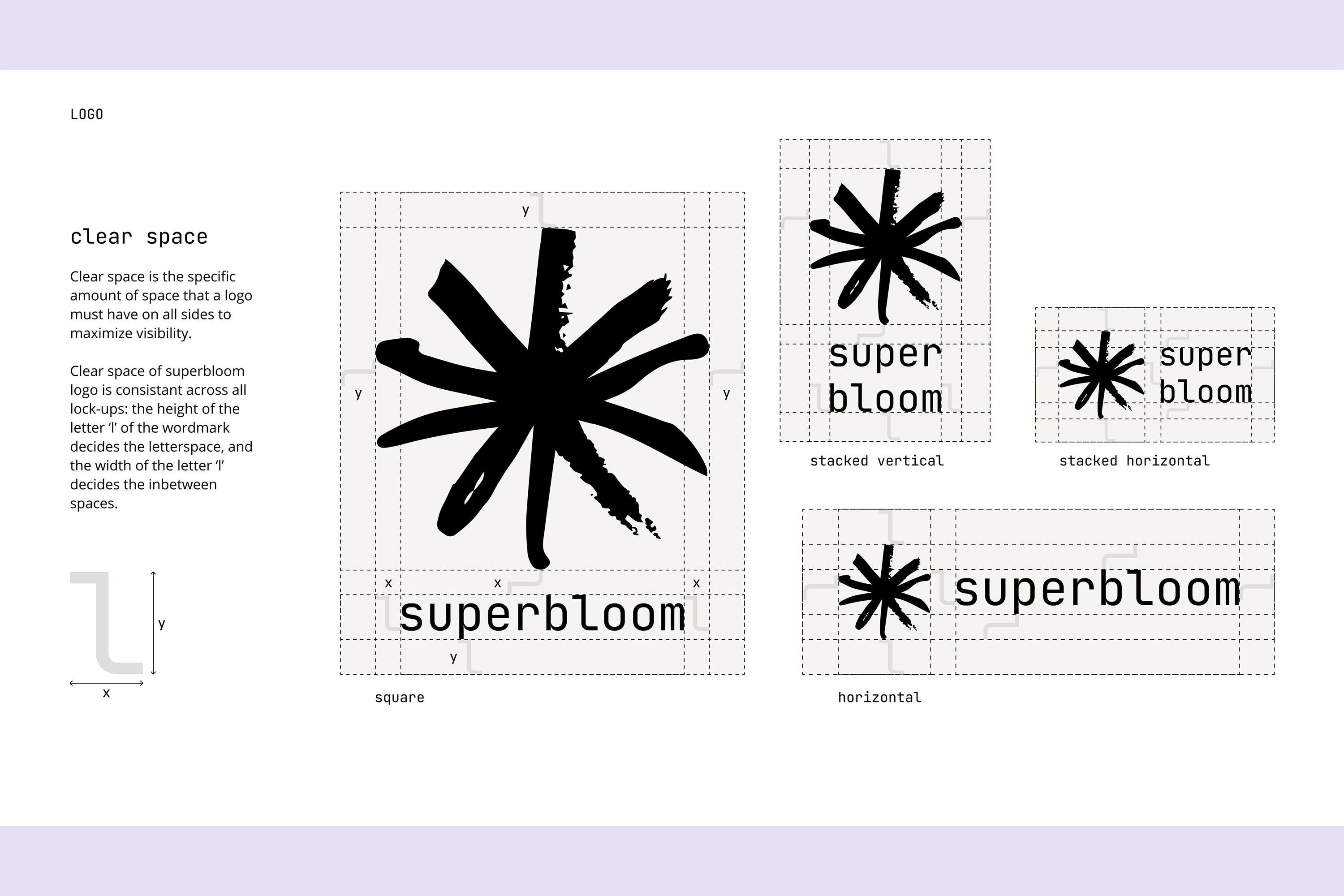
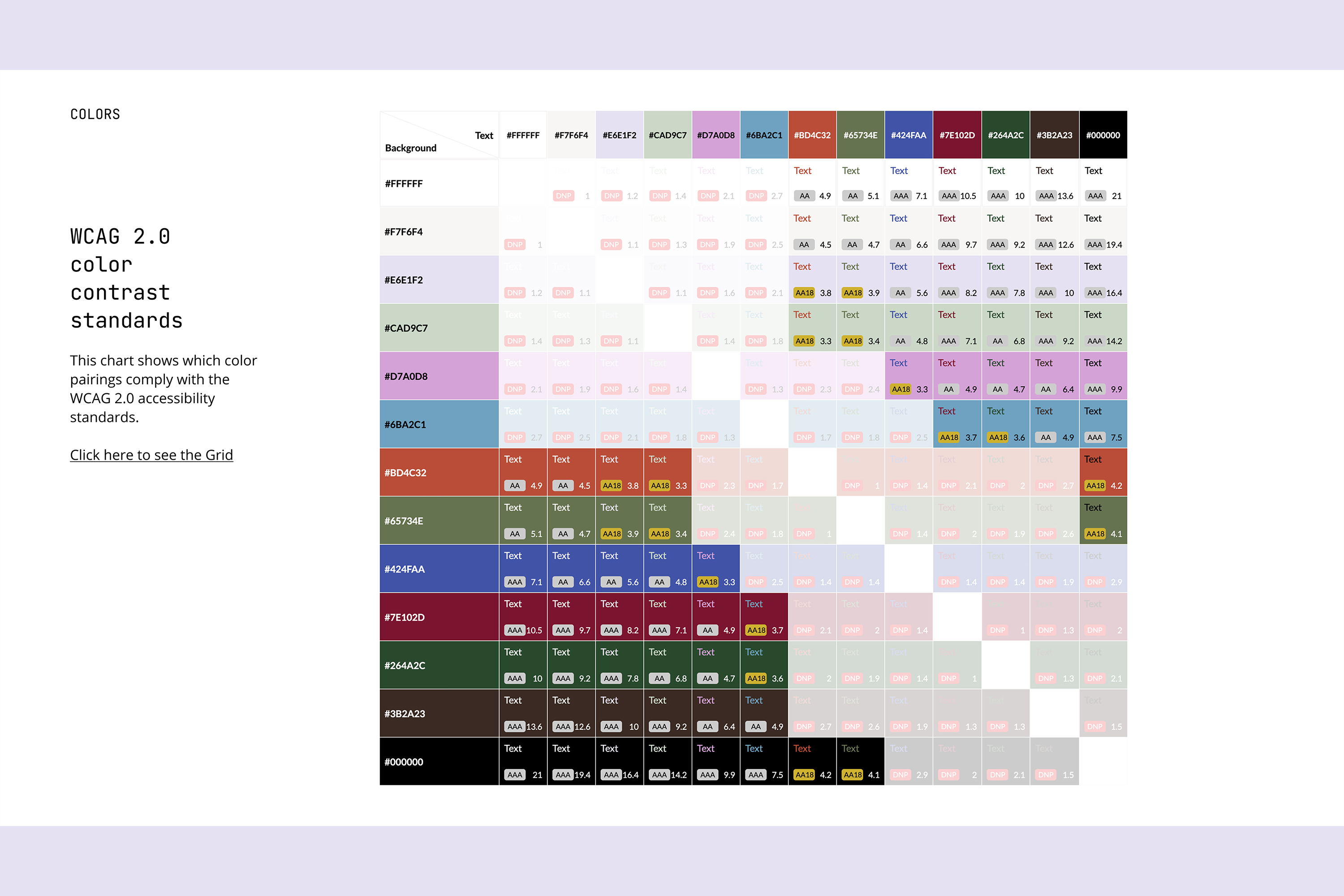
At the center of the rebrand is a custom asterisk logo, chosen for its symbolism around complexity, privacy, growth, and especially community. To emphasize collective authorship, I invited each team and board member to hand-draw an asterisk, which I combined into a single composite mark. The visual language draws from nature-inspired colors with a digital edge, paired with JetBrains Mono—a developer-friendly, open-source typeface—to bridge humanity and technology.
Collaborators
Superbloom, And Also Too